CompAndSave
-
Technical Scope
HTMLCSSJavaScriptPhotoshopIllustratorVolusionMagentoGoogle AnalyticsCJ AffiliateShareASale
Summary
Promoted retail sales of quality printer cartridges, toners and accessories, collaborating with marketing department to provide website articulation and execution, social media management, infographic design, and email database browser compatibility testing. Monitored and reported email campaign results through Google Analytics. Applied graphic design to marketing collateral, including print materials.
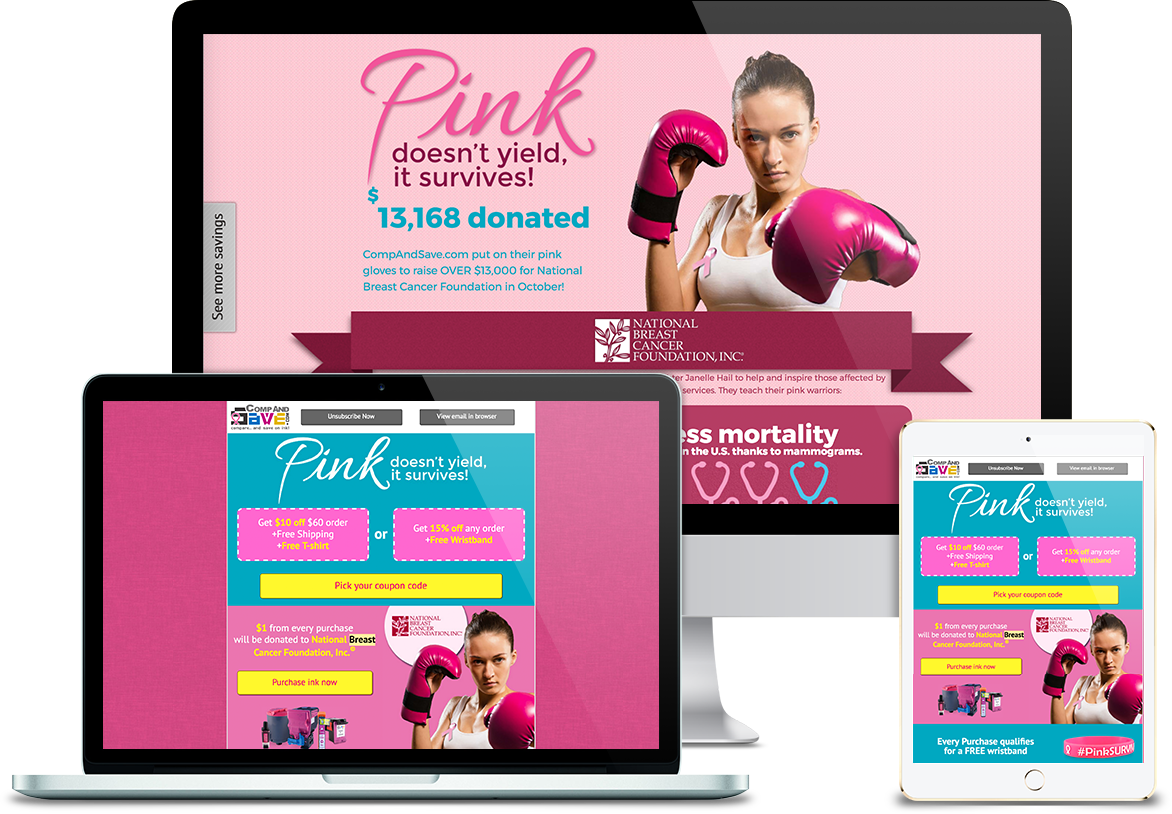
Breast Cancer Awareness- View Demo
This was a campaign to donate to National Breast Cancer Foundation, Inc. (NBCF) on Mother's day. CompAndSave would donate $1 to NBCF for each purchase, and this was an informative web page about the result of the donation at the end of the campaign period.
Challenge-
- CompAndSave's target audiences were men and women, between the ages of 50 to 60. They were mostly prefer browsing internet with computers.
- Design should be matched with the subject, "Pink doesn't yield, it survives!"
- Campaign data and the donation check should be included in the design.
Solution-
- My solution was to create an animated infographic page to make the page interesting and to make reader's eye follow the flow. I the female boxer image was to associate with the subject. The major color was pink and magenta to create female feel. I also added blue turquoise as contrasting colors. Because of the age of our audiences, I increased font size for the eligibility.
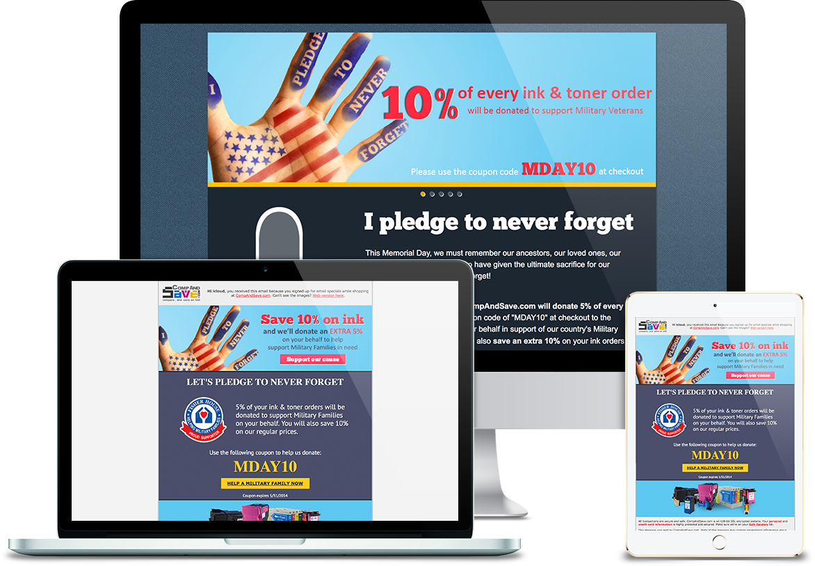
Memorial Day- View Demo
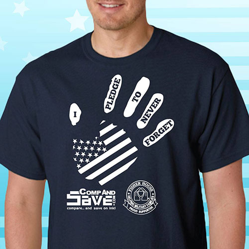
This was a Memorial Day campaign. CompAndSave would donate 5% of purchase to Fisher House Foundation (FHF). The campaign also included print materials, such as T-shirt.
Challenge-
- The campaign subject was "I pledge to never forget"
- The design should be patriotic and touched.
Solution-
- The color I used was marine blue and yellow to recall people's memory of Army Service Uniform and patriotism. Fonts I used were mostly Calibri which was san-serif, and some Chunk which was serif font on subject to give veterans feel and stand out the subject. Images I used were Army parents with children to create a sensation of families and point to the campaign subject.
The major color of the T-shirt was marine blue, and the illustration was a combination of a palm and U.S. flag. The position of the palm was like putting right hands over hearts when saying the pledge of allegiance to show respect to the U.S. Army and veterans.
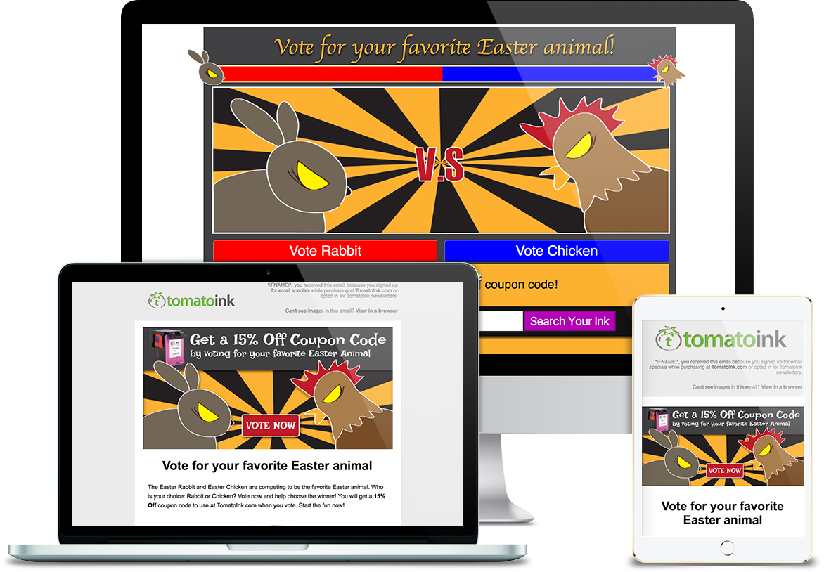
Easter Day- View Demo
This was a Easter Day Campaign to vote people's favorite Easter animals so the campaign was to get whole them involved.
Challenge-
- The TomatoInk target audiences were young students and adults.
- The design should also bring kids to join.
Solution-
- My design was inspired by Street Fighter because that was a young people's favorite game, and battle games would make people motivated to play. The color I used was bright and exaggerated contrasting color, and fonts were cartoonish.
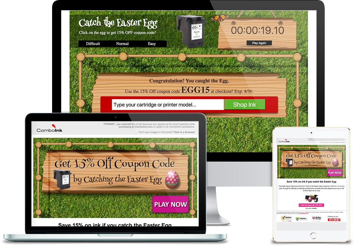
Easter Day- View Demo
This was a Easter Day Campaign to get customers and their friends involved.
Industry-
Challenge-
- ComboInk target audiences were ages of 30-40 men and women.
- Easter eggs were the campaign subject.
Solution-
- Because ages between 30-40 people liked to play mini games during waiting or meeting breaks, I decided to make a catching Easter eggs game. The difficulty was customizable so customers didn't need to spend a lot of time on each round. By the way, The most successful part was the ranking list feature, because my co-workers were crazy for the game for a while to break someone's record.
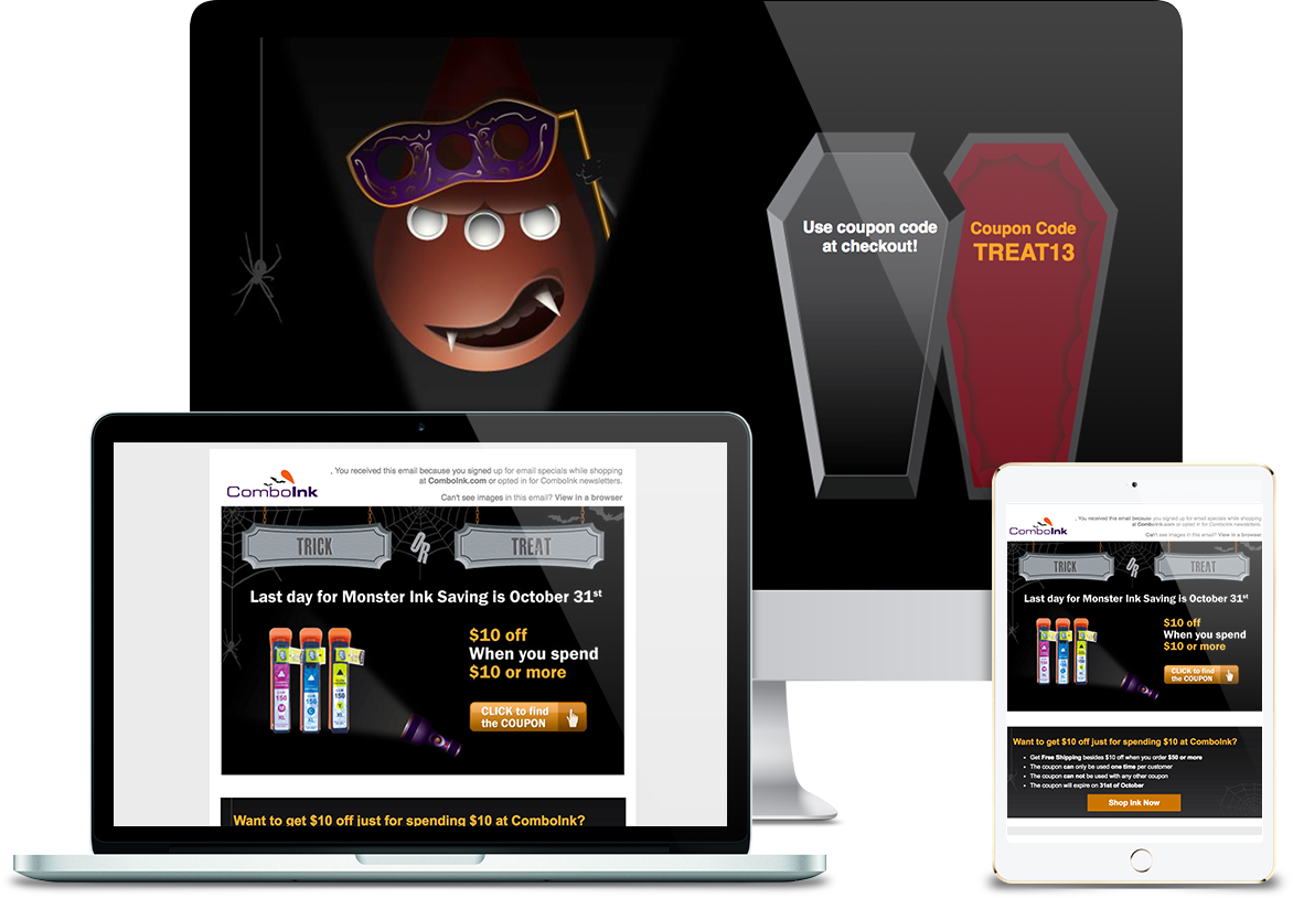
Halloween- View Demo
This was a Halloween Campaign to let customers have feels of Halloween.
Challenge-
- ComboInk target audiences were ages of 30-40 men and women.
- The design needed to match with Halloween theme.
- Trick or Treat was the campaign subject.
Solution-
- Due to the campaign subject, I designed a little game. The purpose was to get customers involved rather than let they to win the game so no matter what they had chosen, they would get the coupon code eventually. The major color was consisted of orange and purple which would match Halloween theme. Besides, I designed a ComboInk mascot with Halloween style using Illustrator to let ComboInk target audiences more familiar with its brand.
Key Achievement
- Consistently delivered on-time, quality monthly assignments for three brand sites, including six campaigns with A/B testing, social media banners, Google AdWords banners.
- Championed holiday and health support campaigns, including Breast Cancer Awareness and Memorial Day breaking highest click-through and conversion rate records.