Create a Thon
-
Technical Scope
PhotoshopIllustratorInDesign
Summary
The Silicon Valley Business Journal presents the Create-a-thon sponsored by Wells Fargo. The competition will pair small business owner with marketing, advertising and graphic design students from local universities. That team of students will be tasked with developing a creative media campaign that addresses small business owner needs and meets the budget guidelines for the competition. Business owner gets a great student analysis of his/her business. Small business owners and their student teams will compete in a contest where one finalist will win $25,000 in sponsored advertising in the Silicon Valley Business Journal.
Contest Details
- The student will be partnered with a small business and have 2 weeks to develop a print and/or online advertising campaign.
- The student will present the campaign in front of a judging panel.
- The winner will have their work published in the Silicon Valley Business Journal.
The Mmoon Empanadas-
The Mmoon is an established restaurant in downtown San Jose that serves Argentine inspired empanadas and salads.
Industry-
Quick Service Restaurant & Soccer Lounge, specializing in Argentine inspire
Challenge-
- Educating people about a new food, empanadas
- Wrapping food around a soccer concept
Full page ad-
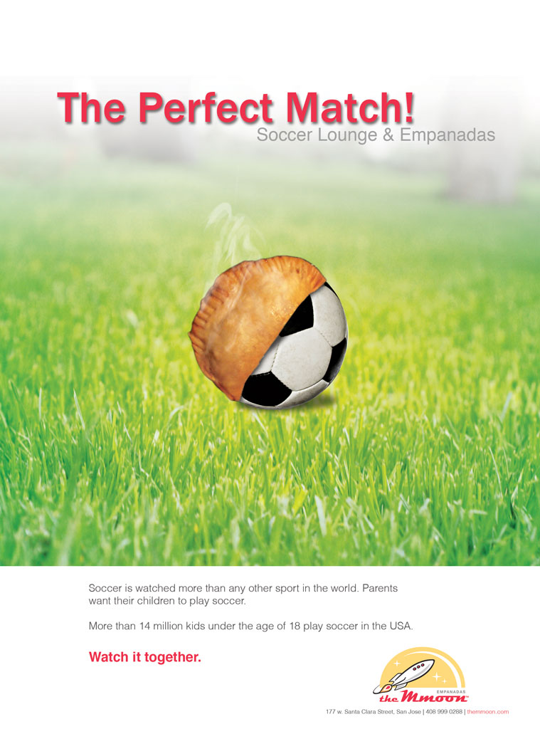
Mmoon restaurant is a place for soccer fans to watch soccer and eat empanadas. My task was to make ads that emphasis on soccer lounge and empanadas. To make soccer lounge and empanadas into the same design, I used an empanada and a soccer ball combined together to lead into the tagline: “the perfect match”. The placement of the subject is in the middle which catches the audience’s attention. The empanada has a seared smoke on top as if it just came out of an oven. I used red, white and grey for the text because the title really needs to stand out. So red is a good choice because it unifies the title and the important message “watch it together” and it’s also the color for food. The green grass background serves the perfect complementary and it completes the soccer look and feel.

Island ad-
DesignTo spark interests, I made this animated ad where the soccer ball hits the net, score! Goal! And to have a taste of victory. Followed by Soccer lounge in red with grey text of soccer first, family friendly. I then used the color of Argentian’s flag in blue to say “made in Argentina” an actual piece of the empanada is then transformed into the MMOON logo. Finished with address and website information.

BLR Sign Systems-
BLR Sign System, established in 1978 as a specialty parts engraving business, has evolved into a full service visual communications company.
Industry-
Signage and Graphics
Challenge-
- Convey the value of digital signage to businesses of all sizes but with a special emphasis on very small business as they are often left out of or are slow to respond to new technology
- Let the market know about the unique value proposition
Full page ad-
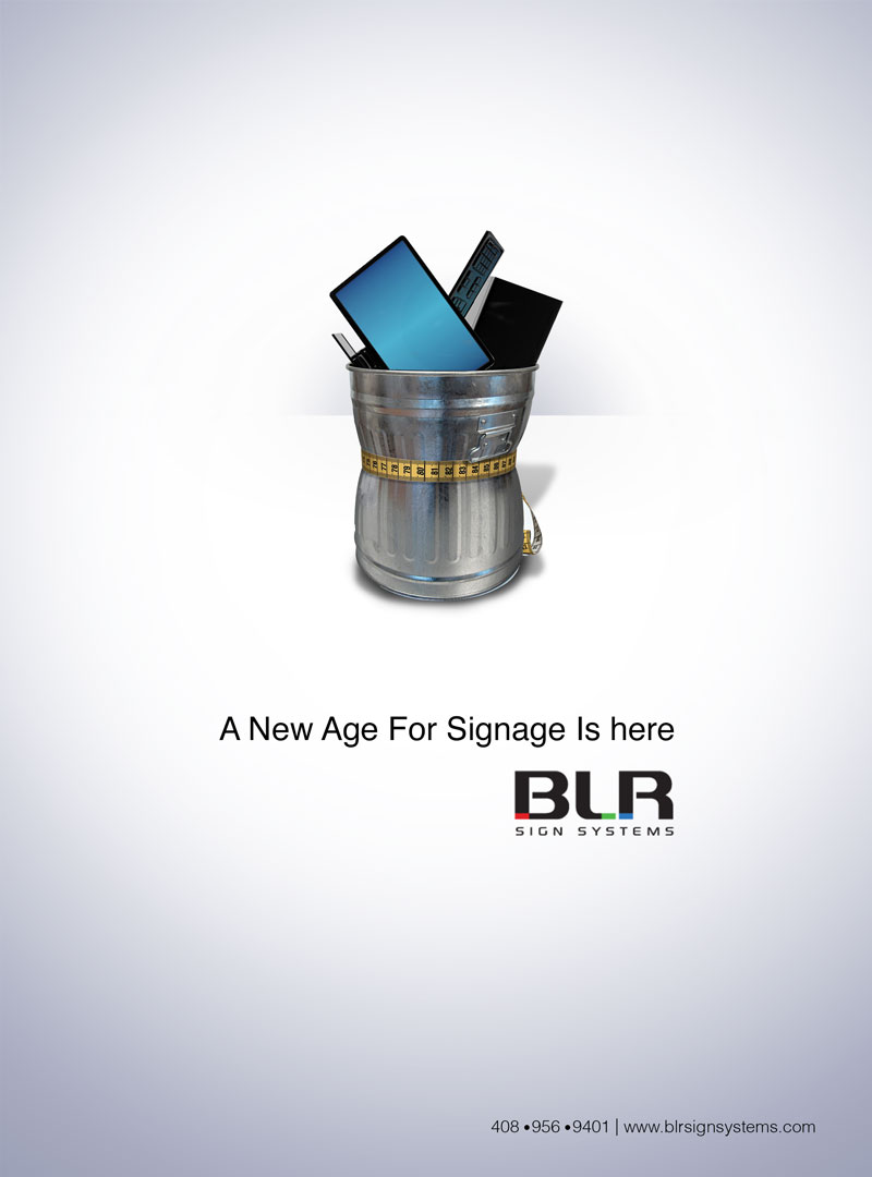
My design is taking old computers and other devices and putting them away into a trash can. The message is to let business know that there is a more advanced technology out there. Digital signage. The colors I used are black, greyish blue, and white to create an isolated feel that associates to technology. The layout is clean and simple, with a modern feel of technology. Bringing the focal point of the full can of abandoned computers to the tag line of " A NEW AGE FOR SIGNAGE IS HERE."

Half page ad-
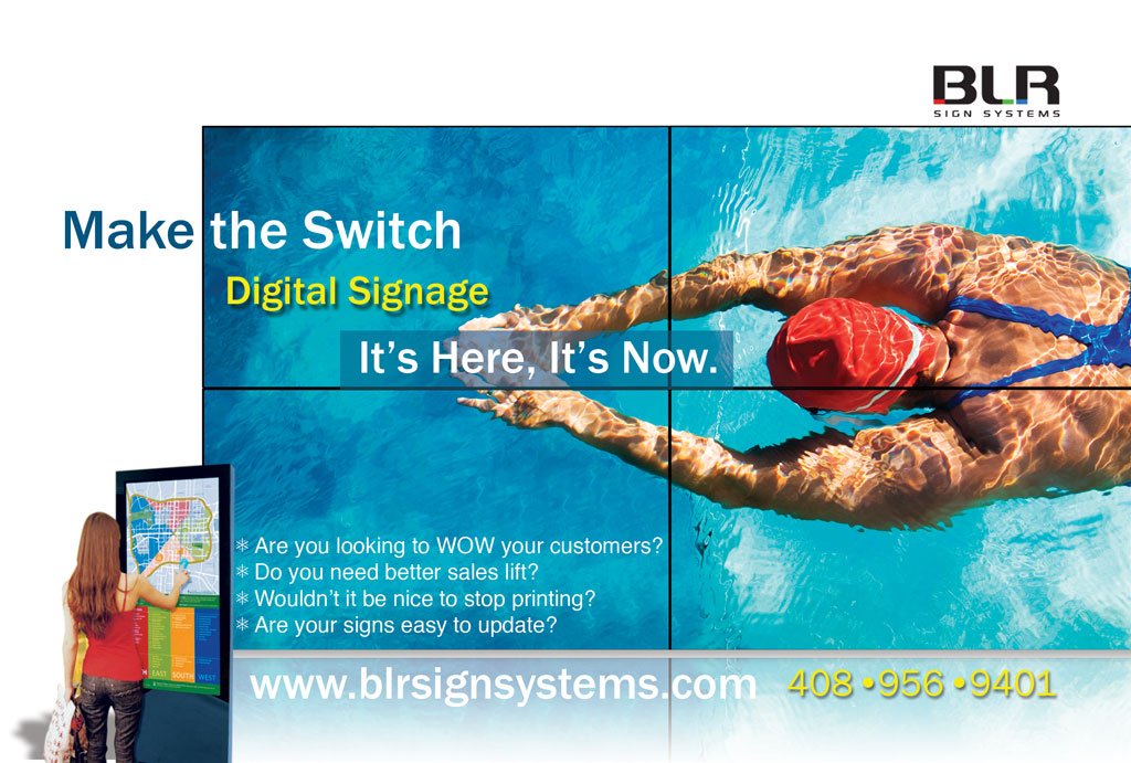
In order to better educated the public on digital signage, I used images of digital signs into the ad. The color scheme is white and light blue to keep the overall look to be as simple and clean as possible. The texts are aligned to the left to make it easier for the audience to read. The yellow and white texts on the title and contact info works well together to complete the overall look and feel of clean and simple.

Island ad-
This animated ad is a display of digital signage with information build inside of it. It features images of digital signage and catchy tagline of: “make the switch, digital signage, it’s here it’s now” and the company info is on the bottom.

Leaderboard ad-
The train is to implied current trend. Digital signage is everywhere, don’t get left behind. I choose a blue color scheme where the sky, train engine, and caboose, are all blue and associated with technology.
